AI & Blockchain redefining markets
conference design
End-to-end branding for New York's frontier tech conference
Skills
Design system
Digital assets
Printed materials
Web design
Team
Chen, Designer
Geiger, Designer
Timeline
Mar - Apr 2025
Tools
Figma
Adobe Illustrator
Overview
From concept to the conference floor.
Working together with my co-designer, we built the complete visual identity, from the first speaker announcement on LinkedIn to the banners lining the venue on event day. AI and blockchain are changing the rules of how value moves and decisions get made. The design had to reflect that momentum across every touchpoint (digital, print, and web) and speak with one voice.
impact
1,000+
Attendees
Professionals, builders, researchers & students
24
Partners
Included Google, Ripple, EY, MoonPay, Optimism, and the Solana Foundation.
10,000
Website visitors
Unique visitors in a single month
Website design
How do you make a dense, fast-moving program easy for one person to navigate?
Before the event: converting interest into attendance.
Our first job was to turn curiosity into registrations and to draw leaders from Wall Street, crypto, and academia with a design that matched the quality of the speaker list.
In its first month, the site drew over 8,000 unique visitors, which is the reach the entire registration push depended on.
On event day: a companion in every attendee's pocket.
With 1,000+ attendees registered and sessions running in parallel, the hardest problem for people on the day would be orienting themselves. They had to easily figure out what session is on now, who's speaking, and where to go.
The site had to be a mobile-first companion built around those questions and designed for the phone, since that's what most people would look to during the event.
Agenda
Designed for easy comparison, not just reading.
The afternoon sessions ran in two locations, so attendees needed to easily compare sessions rather than scroll through a single list. On desktop, both tracks sit side by side for direct comparison. On mobile, showing both at once would crowd the screen, so we used a toggle to easily switch between the Verizon and Tata agendas instead.
speaker
90 names, made scannable.
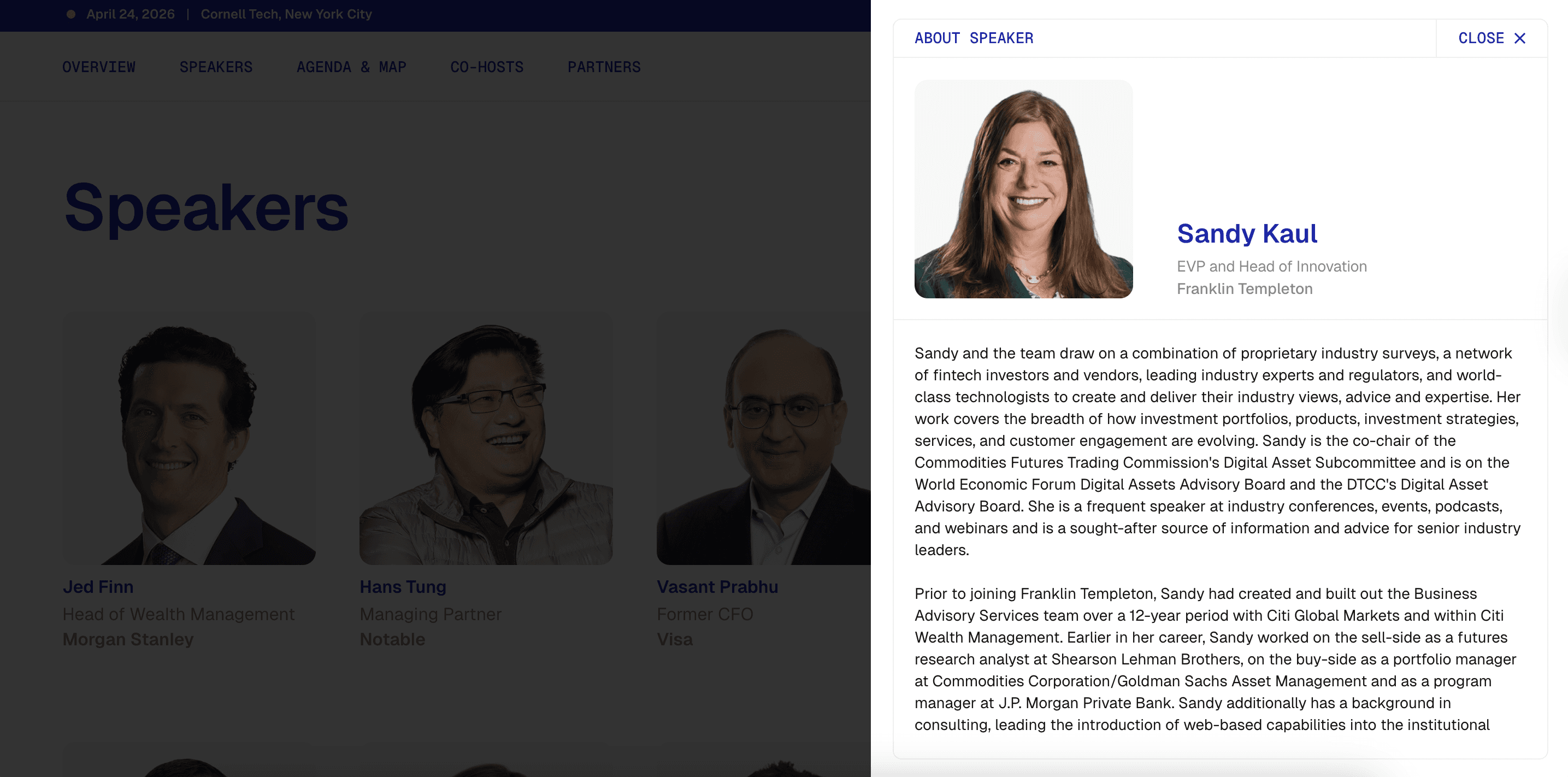
With 90 speakers, the directory had to be easy to navigate. Each card held the speaker's name, role, and company. Tapping these opened their full bios, allowing an attendee to find their profile in one step.
Map
Easy wayfinding for a live venue.
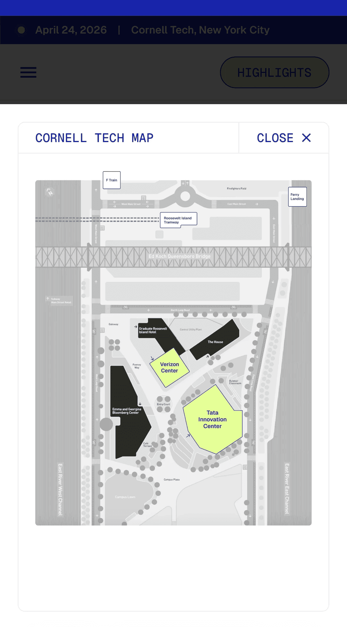
A conference can be easy to get lost in, especially across an entire campus. The map shows the buildings where the sessions were held and their locations. While looking at the agenda, attendees could check the location of the session they wanted to attend.

Digital assets
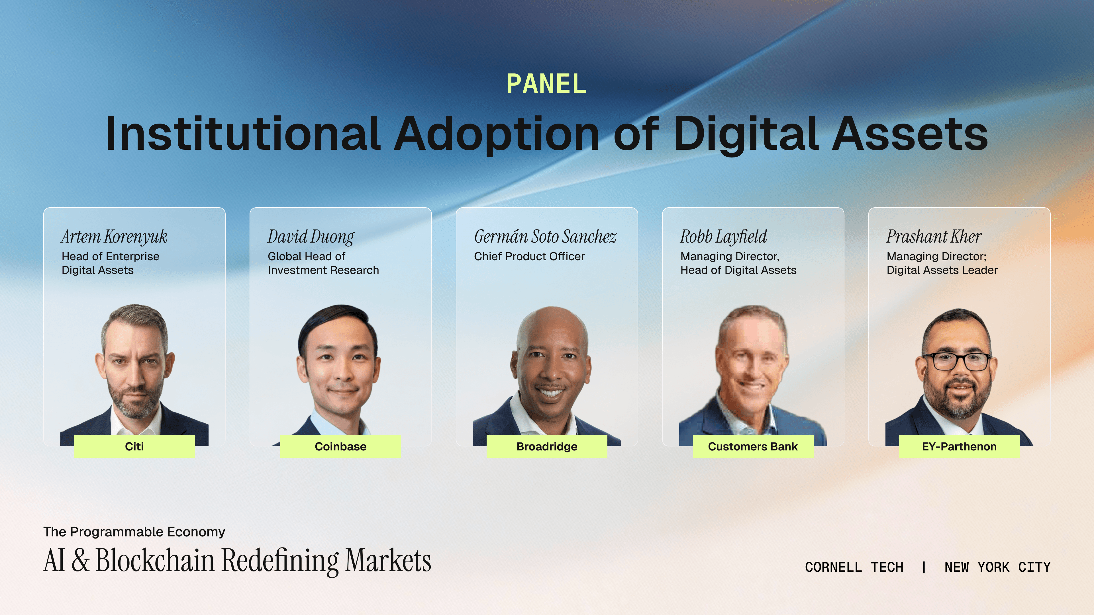
Speaker and panel announcements had to ship fast and share a cohesive look. I designed the social graphics as a modular template system that applied the same visual language to every announcement. This enabled us to create new posts quickly as the speaker lineup grew.



printed assets
Banners, vinyl clings, posters, and ID badges each had to translate the digital identity into the physical space. They had to be able to hold up at large-format output, where color, scale, and legibility behave differently than they do on screen.
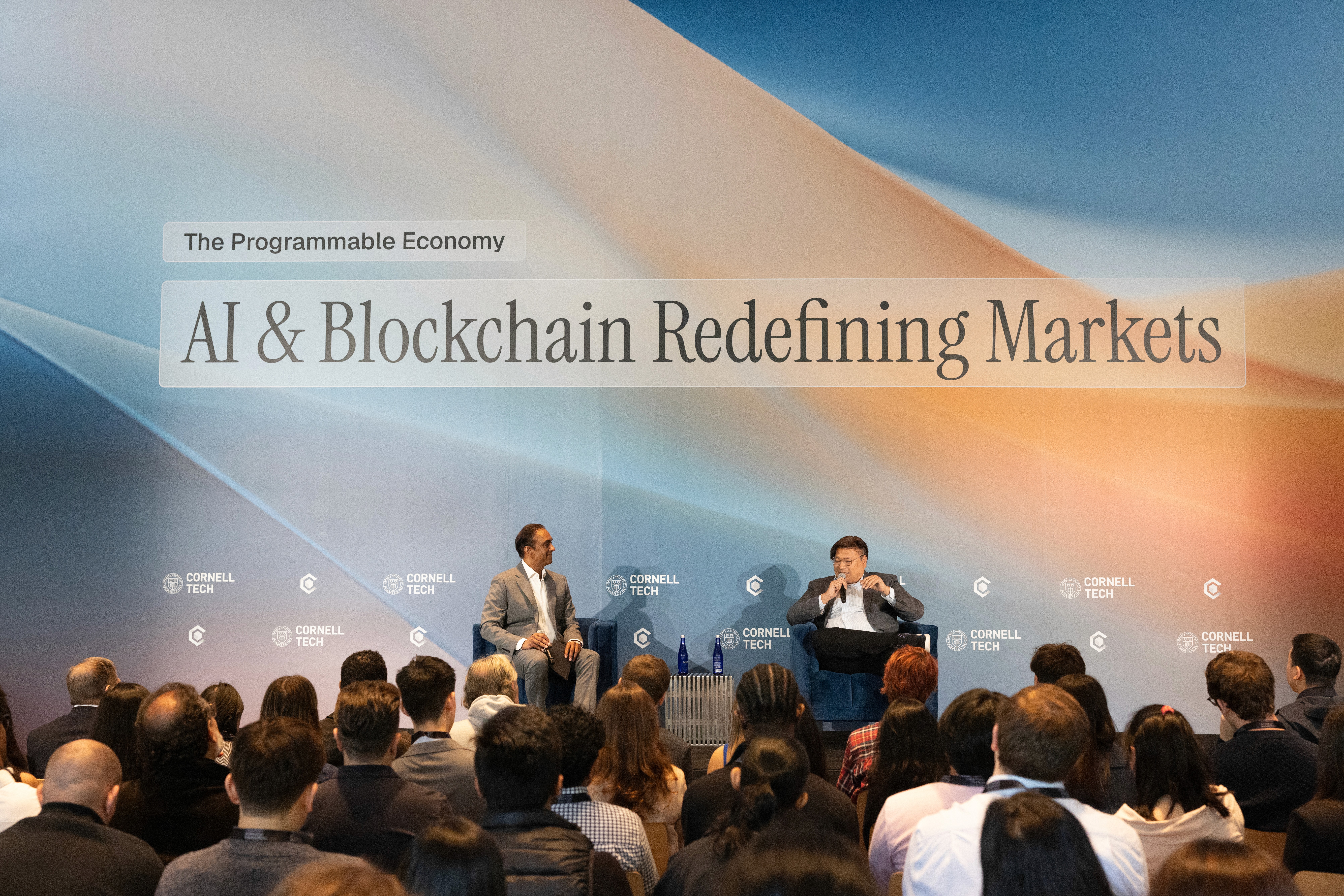

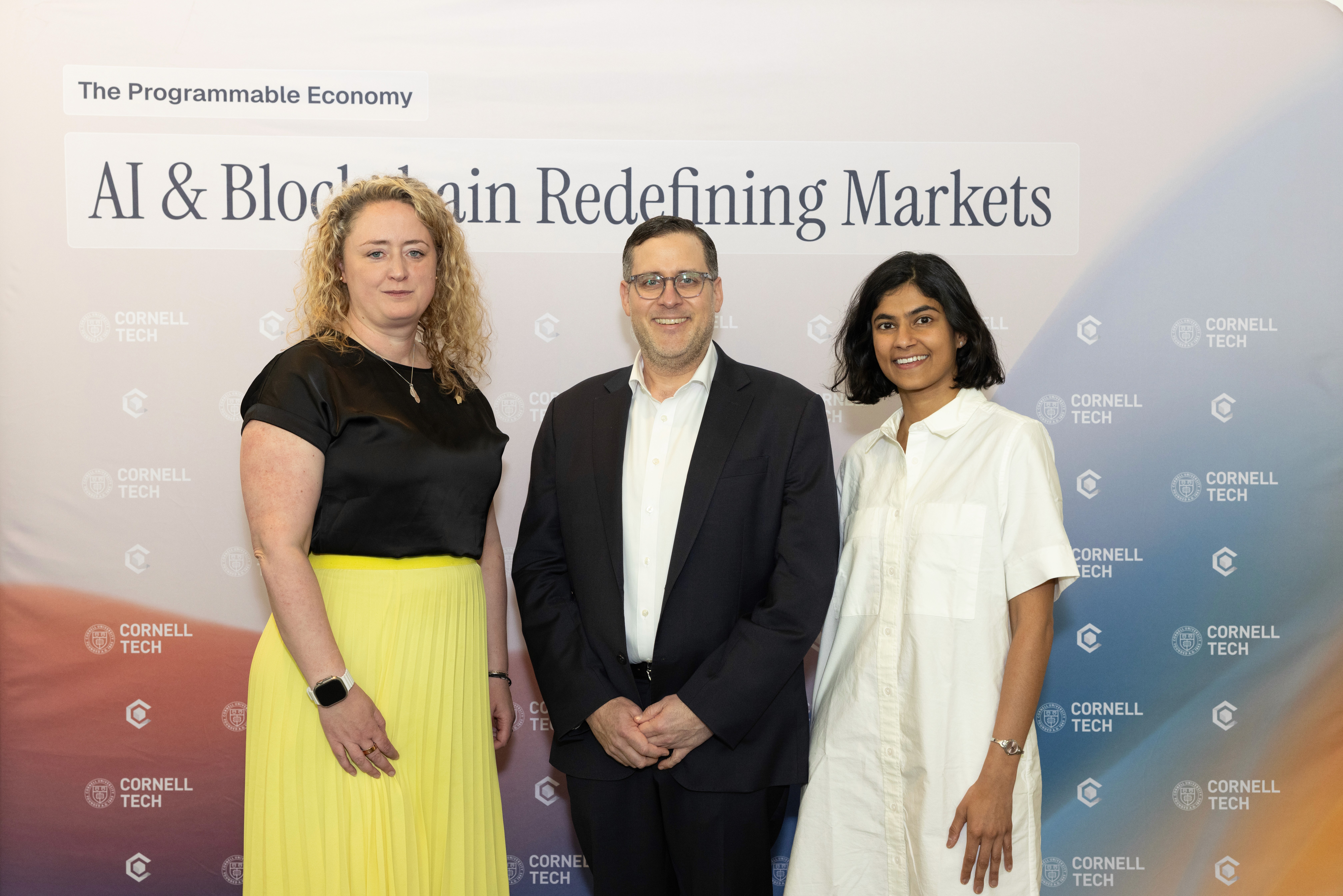
Photographs by Lina Shteyn.
Thoughtful design starts with a conversation— let's chat.
Designed with love. All rights reserved.