Altes
brand design & web development
Helping a 45-year investment firm tell its bigger story.

Context
How do you make a complex, multi-strategy firm clear to the people who invest in it?
Altes Capital has been investing since 1981. Over time, it grew from a real estate focus into a full alternatives platform including opportunity zones, multi-strategy funds, liquid alternatives, insurance-dedicated funds, and more. But you'd never have known it from the website, which still talked like a real-estate boutique and buried everything else in dense copy.
I led the redesign of the site's structure, messaging, and visual system, plus the brand system that carries across the firm's fund decks and client materials. The goal was to make the site tell the firm's real, bigger story, and make it feel as forward-thinking as the firm actually is.
the audit
I started by pulling the whole site apart.
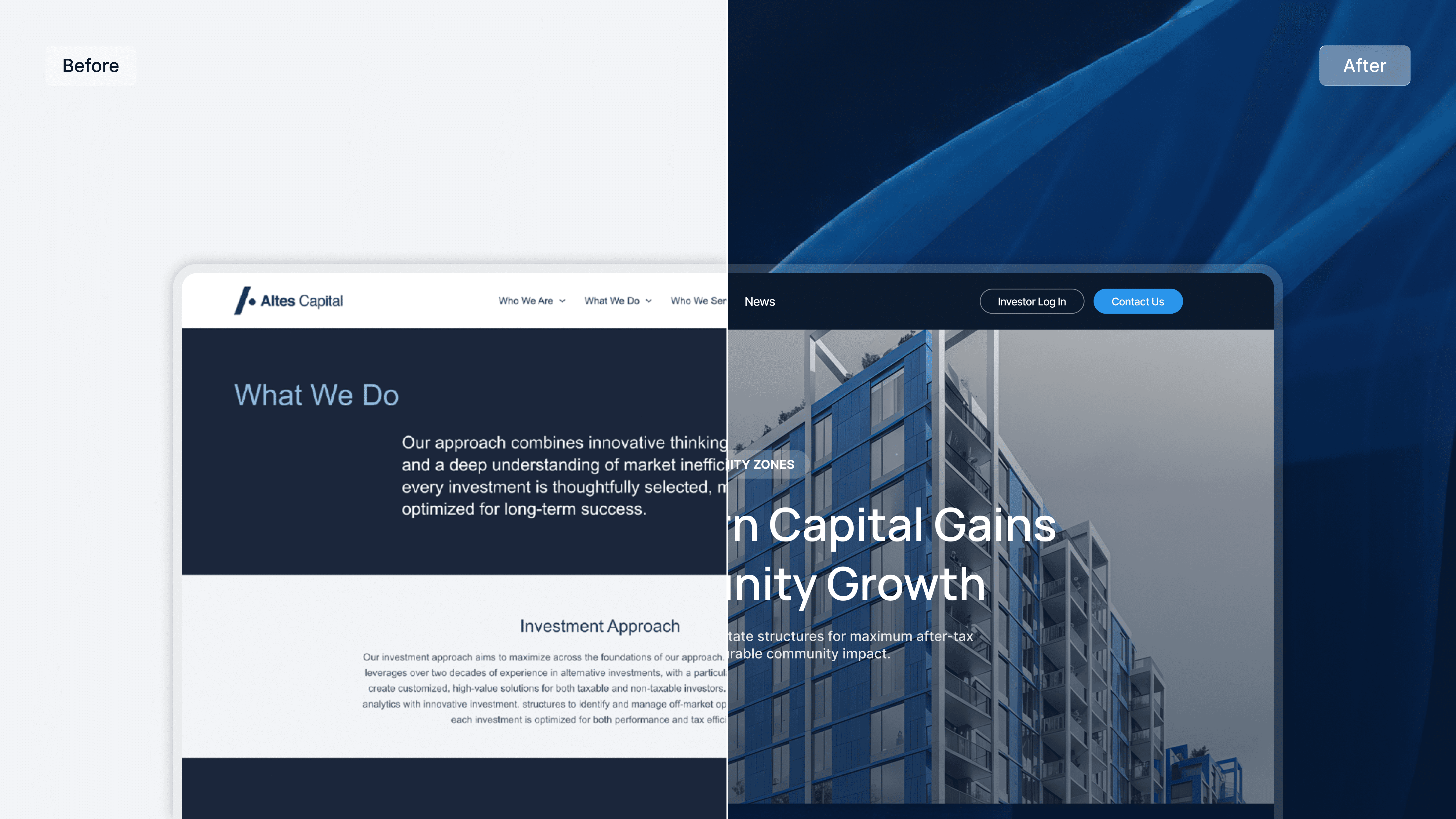
Before designing anything, I went through the live site page by page and compared it against strong finance brands setting the standard in this space. I wanted to know what "institutional but modern" actually looks like, and exactly where Altes was falling short.

The same problem kept surfacing: the site was telling the wrong story. For a firm whose entire business runs on trust, the site was quietly working against it.

Key offerings hidden behind real estate
The homepage was all real estate, and the value was buried in long copy behind vague labels

Unpolished, misleading interface
Static cards had hover effects that made them look broken, elements were misaligned, and the logo mark was overused.

Design contradicts with the positioning
A static process graphic and low-contrast CTAs worked against the firm's tech-forward positioning.
Information architecture
A home for every fund.
On the old site, all that nuance collapsed into a few paragraphs of general copy, so a prospect had no real way to dig into the one strategy they actually came for.
I laid out the firm's strategies as a clear set rather than a single dominant offering. Real estate went from being the whole story to one of six. That is what turns Altes from a boutique into a platform and makes a genuinely complex business feel navigable.

I gave each fund its own page.
Somewhere a potential client could land, understand what the fund is, see how the firm approaches it, and decide whether it fits their needs without having to book a call. Every page shares the same backbone: what it is, how Altes runs it, who it's for, and the numbers behind it — so an allocator weighing two funds can compare them like for like.
Giving each fund a face.
Each fund had to be distinct but still look like they came from the same firm. Copy alone wasn't going to carry that.
I generated a signature image for each fund with AI. I treated it as a system with a single art direction, one palette, one visual language. Each fund ends up with its own identity and lined up side by side, they read as a family.

Data visualization
Making the numbers move.
The firm wanted to feel tech-forward, but the site looked static and traditional, with a dense process graphic. I rebuilt the firm's proof points as interactive, scroll-triggered visualizations. Instead of asking someone to parse a chart, the firm's scale unfolds one beat at a time as you move down the page. For a firm that sells proprietary analytics, motion isn't decoration. It's evidence.
Brand system
To support the new architecture, I built a scalable modular design system.
Every screen is assembled from the same set of pieces, all tied to shared type, spacing, and color tokens. That's what keeps the site consistent from page to page and lets the firm set up a new fund or section later without the design drifting.


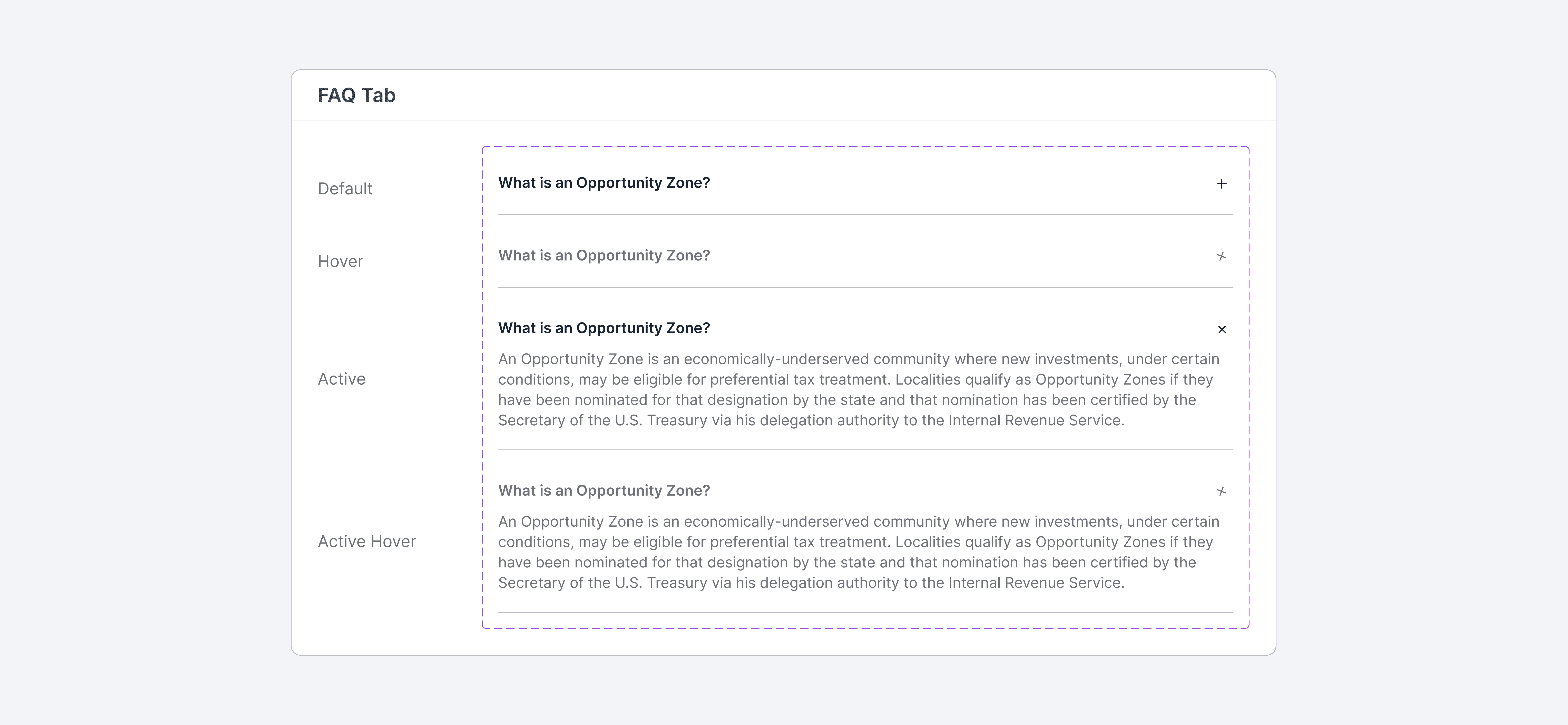
That same system carried straight into the firm's client-facing materials. Fund decks, fact sheets, investor letters, and insight papers all draw from the same kit, so whether a prospect meets Altes on the site or in a pitch, everything looks like it came from one place.


reflections
The real problem was the story, not the styling.
The biggest shift on this project was realizing the site didn't reflect what the firm had actually become. Once I framed the redesign around closing that gap, every decision, from the information architecture to the headers, pointed the same way.
Design a system, not a set of screens.
Building the work as components and tokens is what let it travel — from the site into the fund decks and client materials, and into whatever the firm builds next. The most valuable thing I handed over wasn't a page; it was a system they can keep using.
Thoughtful design starts with a conversation— let's chat.
Designed with love. All rights reserved.